 |
I’m a sucker for a good road trip. Credit my parents, who took my brother and I on a pair of “Griswold Family Vacations” as children — two, multi-week car trips to various national parks and other landmarks during the 1980s.
Back then, there was no Google Maps to help you find your way around. No Instagram for you to upload your vacation selfies to. Just a Rand McNally road atlas — and lots of film to develop when you got home!
As a modern investor in this market, though, a road map is EXACTLY what you need. It will keep you from throwing up your hands, declaring you’re lost, and heading “home” to the safety of 100% cash! So, let me see if I can give you one — the “Larson Atlas” if you will.
Start with the big picture. This chart shows the SPDR S&P 500 ETF (SPY, Rated “C+”) going back to the beginning of 2016. You can see the market’s initial surge in January 2018 ... the renewed push higher in September 2018 ... the subsequent collapse in December ... and the bounce earlier this month.
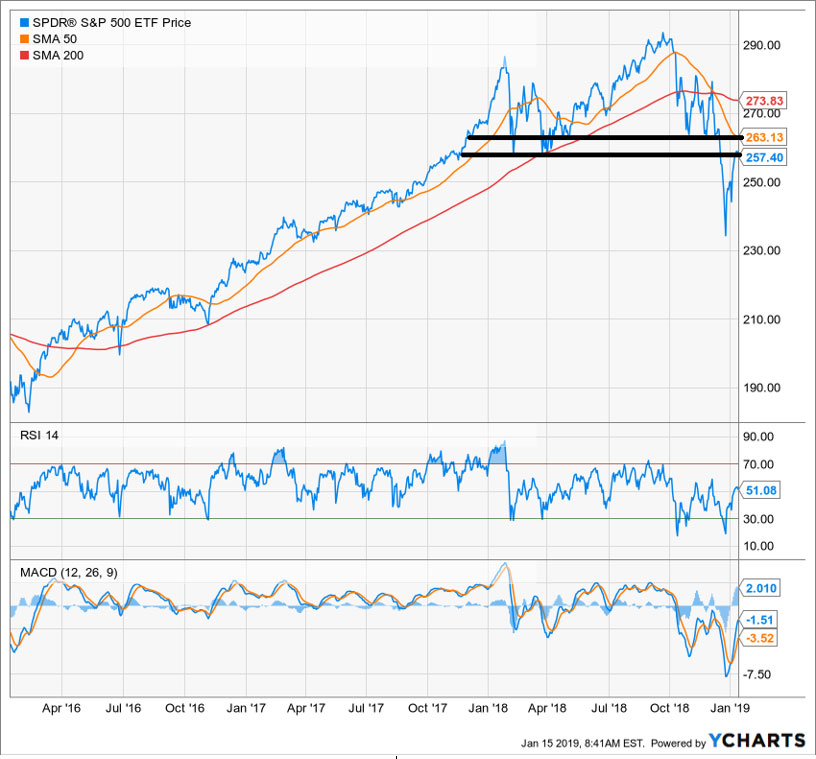 |
What’s noteworthy from a technical standpoint here?
First, the SPY clearly broke down out of a topping pattern that persisted for most of 2018. The support zone marked by the two black, horizontal lines gave way in December. Now, that has become a zone of overhead resistance.
Second, the Relative Strength Index (RSI) and the MACD technical indicators I included at the bottom are confirming the market’s underlying weakness. Our own Weiss Ratings BUY/SELL ratio has been doing the same for a year now.
Third, we’ve seen a dreaded “death cross” in the SPY. That’s when the 50-day moving average plunges down through the 200-day moving average.
That last happened in August 2015, and it led to a period of market choppiness and turmoil that persisted for a year. Before that, you have to go back to August 2011 during the government debt ceiling debacle to find another bearish cross. Several months of volatility followed.
|
The difference between THEN and NOW is simple: We’re much farther along in the economic, interest rate, and credit cycles. In fact, I would argue we’ve already reached a tipping point in all of them — one that makes this death cross much more significant from a long-term perspective than the previous ones.
Bottom line: This technical action pretty much confirms what I’ve been saying for almost a year now. This looks, trades, and acts like the start of the third bear market of the new millennium.
Of course, that doesn’t mean you won’t see sharp rallies. Far from it. As a matter of fact, my next chart tells you everything you need to know on that front. It shows the performance of the Dow Jones Industrial Average from 2007 through 2009.
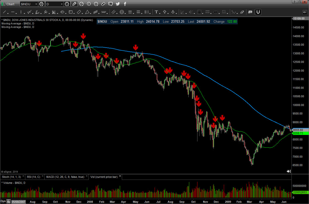 |
Each of the red arrows represents:
1) A Federal Reserve interest rate cut
2) A government-organized bailout or
3) An “alphabet soup” rescue program designed to prop up credit markets.
As you can see, almost all of them sparked short-term rallies. And as you can also see, all of those rallies subsequently failed until the excesses of the bull market and housing bubble were wrung out.
My “atlas” therefore suggests the current rally could last for a little while longer and extend a bit further. I could even see the S&P 500 trading as high as the mid-2,600s.
But that strength won’t last. We’ll see a pullback, and likely a retest or near-retest of the December lows. That will be followed by one last-gasp bounce.
Then when the largely sideways chop ends in a few months, things get serious. The bear market resumes, and ultimately, that move sends us to much lower levels. After all, you don’t unwind a multi-year “Everything Bubble” — one encouraged and underwritten by the easiest monetary policy in all of recorded history — with a couple of 10% corrections in stocks!
So, my advice is as follows: Use this period of relative calm to get your portfolio in order. Lighten up on vulnerable stocks into the rally, and add downside hedges like inverse ETFs while they’re cheap.
Also, boost your gold and gold mining share allocation as a play on increasing volatility. Then buckle up and get ready for a much more challenging market later in 2019!
Until next time,
Mike Larson
P.S. I’m going to discuss my market outlook in much more detail at the MoneyShow Orlando. It runs from February 7-10, 2019 at the Omni Resort at Championsgate and is completely free to attend! Just click here to register or call their staff at 1-800-970-4355 and tell them I sent you. Hope to see you there!